The creation of a new interior is always not easy. We wish it’ll be both stylish and exquisite, beautiful and sophisticated. But at the same time it is important for the room to have the character of those people who will live inside, so it should be individual and special.
Of course in such an important matter it is impossible to avoid the mistakes! They are made not only by those people who are trying to create comfort with their own hands, but even by the experienced professional designers.
Here is 10 most frequent mistakes in design. I hope that knowing of what you shouldn’t do will help you to create more successful interior.
-
Artificial plants:

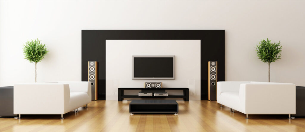
Just once and for all say a decisive “no” to artificial flowers in the interior. Believe me, they would’t fit absolutely anywhere, there is no need to try to find a suitable place for them – they just need to be thrown out. The only exception is artificial trees for interior, but they need to be chosen very carefully!
-
Furniture with upholstery which cannot be cleaned:

No matter how attractive a white velour sofa is in the interior of black and white living room and no matter if your family has perfectionism in terms of cleanliness, believe me the spots on the sofa will appear soon! So when you are choosing furniture always think about how you can clean the upholstery when it’s necessary!
-
One-color interior:

Beige room… Looks like a perfect option, right? But this interior looks boring and impersonal. The same applies to any other colors. It is much better not to use one color in the interior, but to use the combination of two or three shades.
-
“Naked” windows:

Only the design of apartments in the style of high-tech or loft involves the lack of windows (and even then not always), in any other cases, the window should be carefully and thoughtfully decorated.
-
The lack of the light:

Any tricks for creating a perfect interior will be useless if the room has not enough light. The lighting aspect must be carefully thought out! Of course, the interior design of the bedroom and the interior design of the kitchen require totally different approaches to light.
-
Too many accessories:

Of course, accessories and decorative elements give the room a lived-in appearance and a character of its inhabitants, but in the same time they can simply make the room cluttered and untidy. So remember that it’s important to do everything with a measure.
-
Useless things:

Perhaps Hollywood celebrities think that it’s normal to decorate their huge home with incredible and totally useless installations and designer furniture, but in reality it’s just silly to fill the space of apartment with useless things.
-
An apartment in the General style:

In extremely rare cases it is possible to make several rooms, a kitchen, a bathroom and a hallway in the General style so that it will look stylish and not boring. Usually the rooms are just getting too similar and they lose the individuality.
-
Wires in a visible place:

Believe me, there is no interiors which will look nice with the harnesses of wires which are stretching across the room. You should always (!) mask the cables!
-
Too many photos:

There’s no need to explain that, because too many pictures hanging on the walls look out of place in any interior.


