The color theory refers to the idea that a color or a combination of colors evoke different emotions. For interior designers, it feels excellent when a specific room inside the house or office convey emotion. It makes the room vivid and lively.
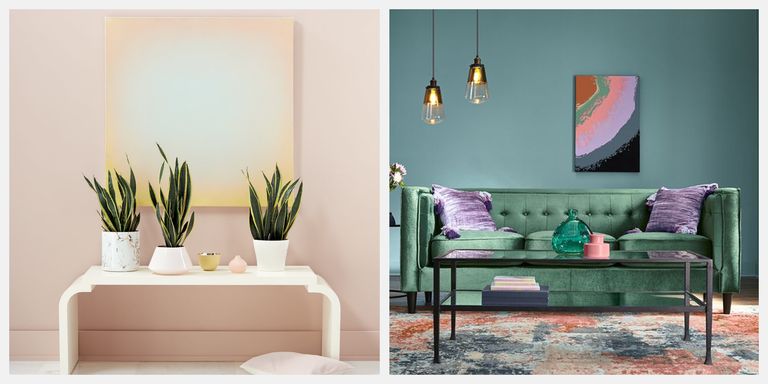
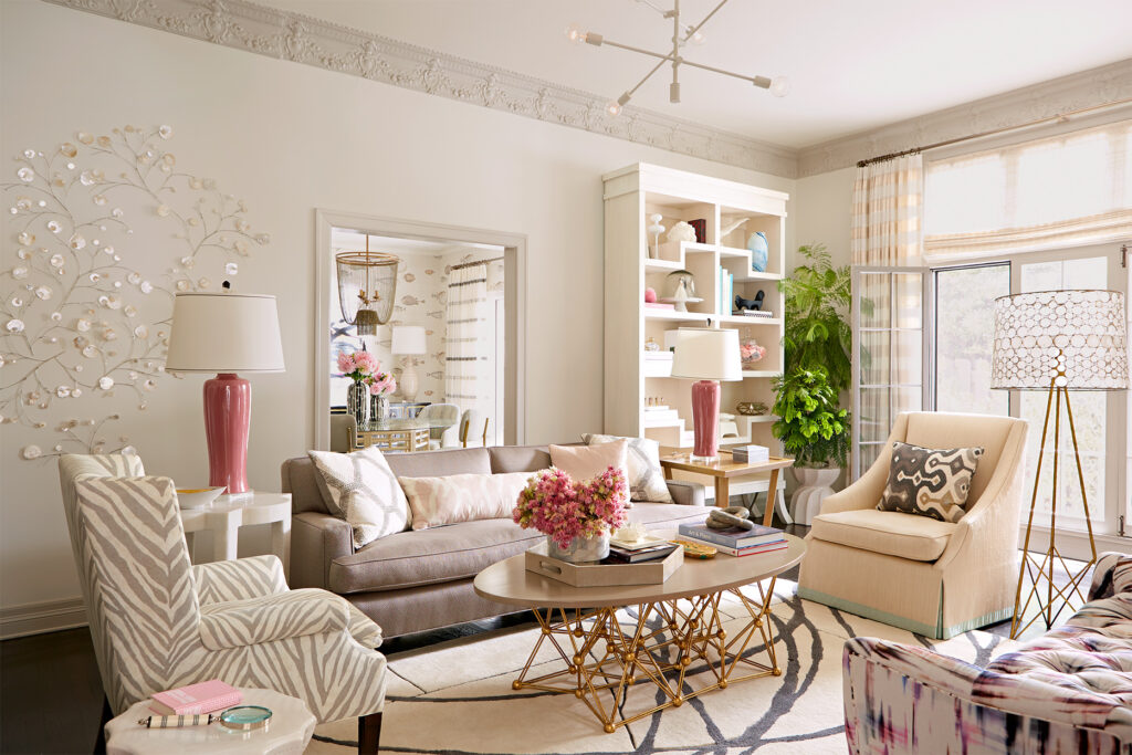
If you want to convey energy and excitement, use orange, yellow, and red colors in a room. These colors are perfect for offices  and communal spaces. The colors – green, purple, and blue are perfect for powder and bedrooms
  due to the soothing effect it has.
Whether you consider interior design as a hobby or not, it still wise if you know how to choose the right colors in your home.
The primary color theory is only the first of essential things you need to know when it comes to interior design. There are more ideas that I’m willing to share with you in this article.
Let’s begin.
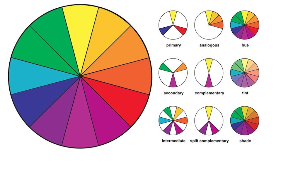
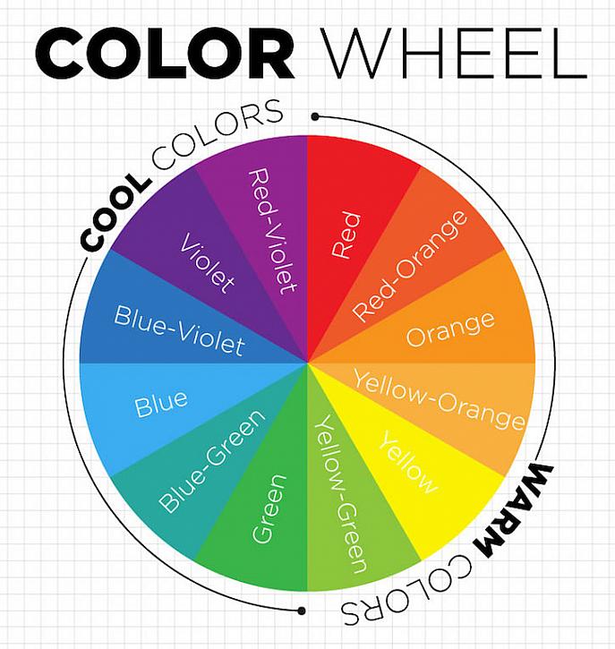
- 🔵 Blue
 Red
Red Yellow
Take note: primary colors aren’t mixed using other colors.
- 🟣 Purple
 Orange
  Green
Green
Unlike primary colors, secondary colors result by mixing the primary colors.
By mixing the primary and secondary colors, you have the tertiary colors on the color wheel.
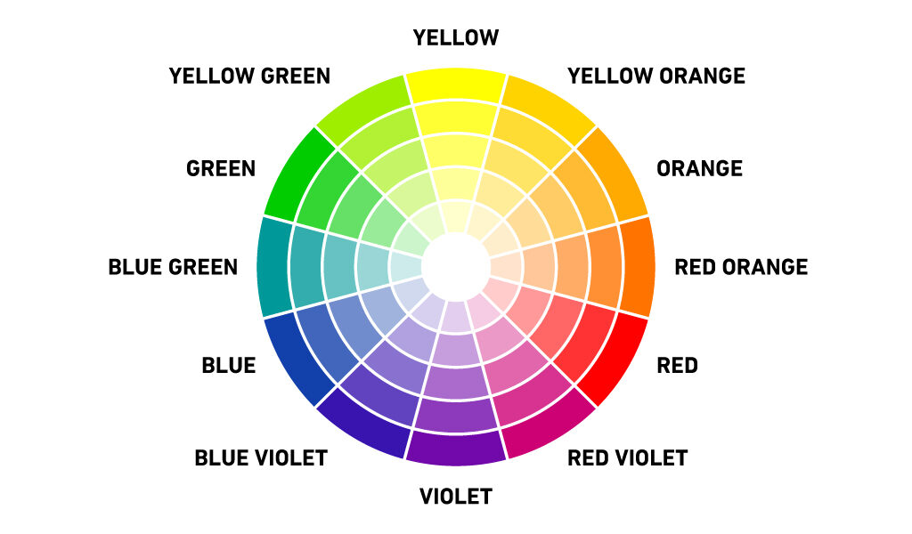
Well, let’s face it – most first-time designers and homeowners are unsure what colors to choose for their home interior. But it’s a wise to start with the 12 colors until you select the right colors that are perfect for your home and office space.
Here’s a good example:
When deciding about a color pallet  , think about the mood you want to show. Pick a dominant color as the base of the color palette. For visual effects, use complementary colors you would see on the color wheel’s opposite.
Remember: selecting complementary colors is a challenge because too much color variation is disruptive. But once you pick the right colors, it’s easy for you to balance the mood of your home.
Now when you understand the primary colors, it’s time to combine those colors with neutrals.
Why?
You can create different varieties of color that fit your office or home interior. Once you combine a primary color with neutrals, you can make a shade darker or lighter.
So, let’s understand this further through the following:
- Tint – You add white to a color to make it white.
- Shade – Add black color to another color that results in a dark tone.
- Tone – You combine gray to a color by darkening it slightly.
For newbie interior designers, it’s wise to experiment with color combinations. These combinations offer a significant effect on the shades you want to see.
Here’s a little problem:
What if you don’t have art supplies at home?
Don’t worry!
Here’s the simple solution:
Go to home improvement stores  near you and buy sample color palettes. You can see and apply tinting and shading using these art supplies.